UX Research,
Product Design (UX/UI),
Design System.
Managing multiple SaaS subscriptions is complicated and challenging for businesses. NachoNacho simplifies everything in one place.
My Role
Platforms
Responsive Web
(Desktop & Mobile).
(Desktop & Mobile).
Tool
Figma, Miro, Notion,
Hotjar, Asana.
Hotjar, Asana.
Time
2022-2024
Overview
In the SaaS industry, managing multiple
subscriptions can be hard. You might pay for unused
seats, forget to cancel a subscription, encounter
hidden costs, or struggle with scattered billing
cycles.
But what happens when the app designed to
simplify the process ends up feeling more
complicated than the traditional way?
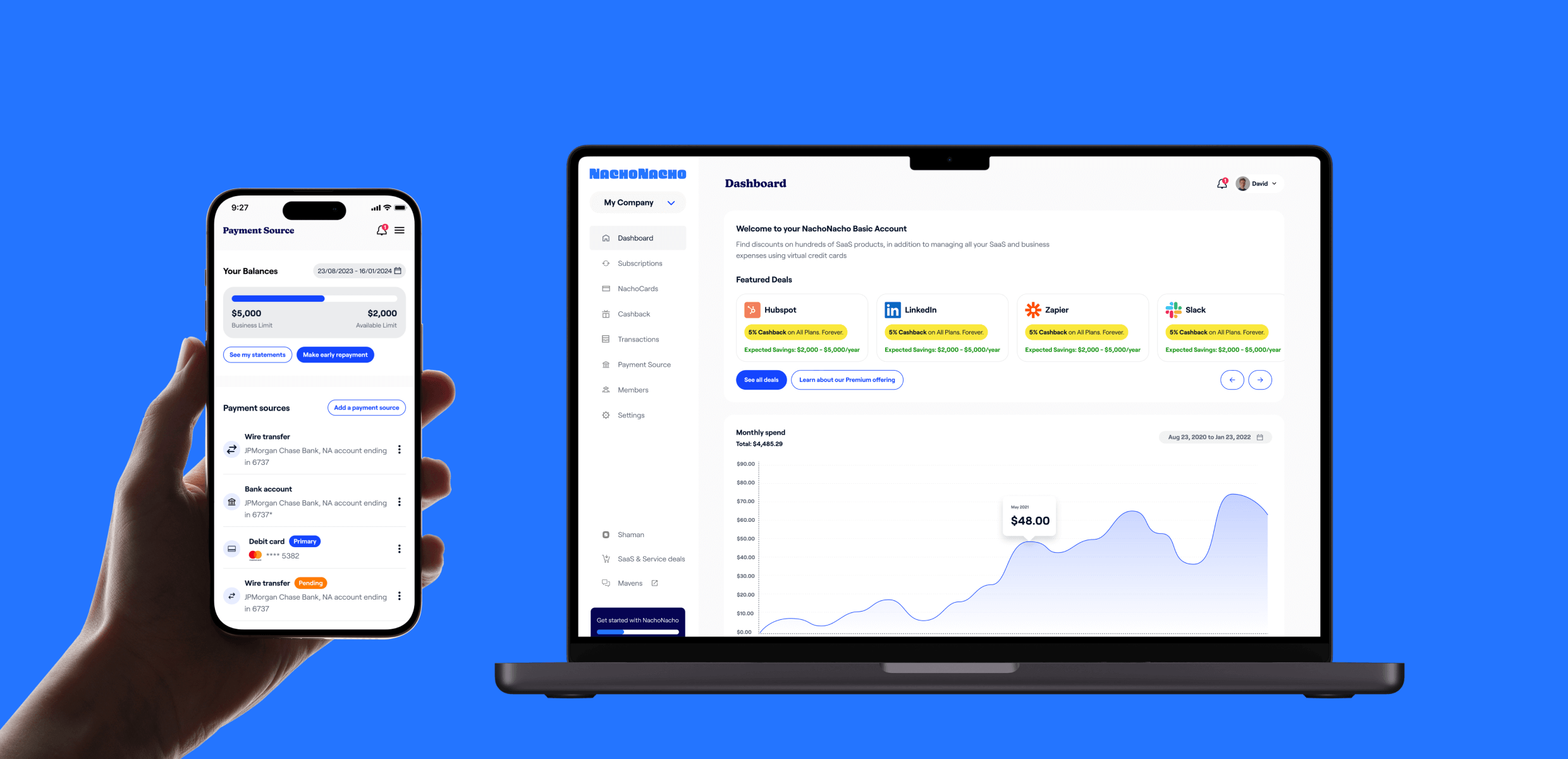
NachoNacho is a B2B SaaS company based in San Francisco that helps businesses manage all their SaaS subscriptions in one place using virtual credit cards. It’s like spend management but for SaaS businesses. They also leverage AI to recommend discounted SaaS products and services from their marketplace of over 25,000 businesses.
In the case study, I discussed how we redesigned NachoNacho to improve the user experience by streamlining onboarding and addressing key UX challenges, ultimately increasing conversions and user engagement.
35%
Increase in Customer Acquisition
32,000+
Active Businesses
800+
SaaS Vendors
Context
I joined NachoNacho in October 2022. In Q4 of that year,
the company faced several challenges, ranging from
branding to the product's UX. They had a
low conversion rate, and many users were not
completing the onboarding process
, among other problems. A few months before I joined,
the company had started rebranding. I came in during a
pivotal time as the company was developing a new face
and voice. However, the challenge was to align the
product with the new brand while prioritizing
user growth and
expanding our reach.
My Approach
While we had some assumptions about our problems, I
wanted to identify the user's core pain points and
gain insights into potential solutions using various
research methodologies.
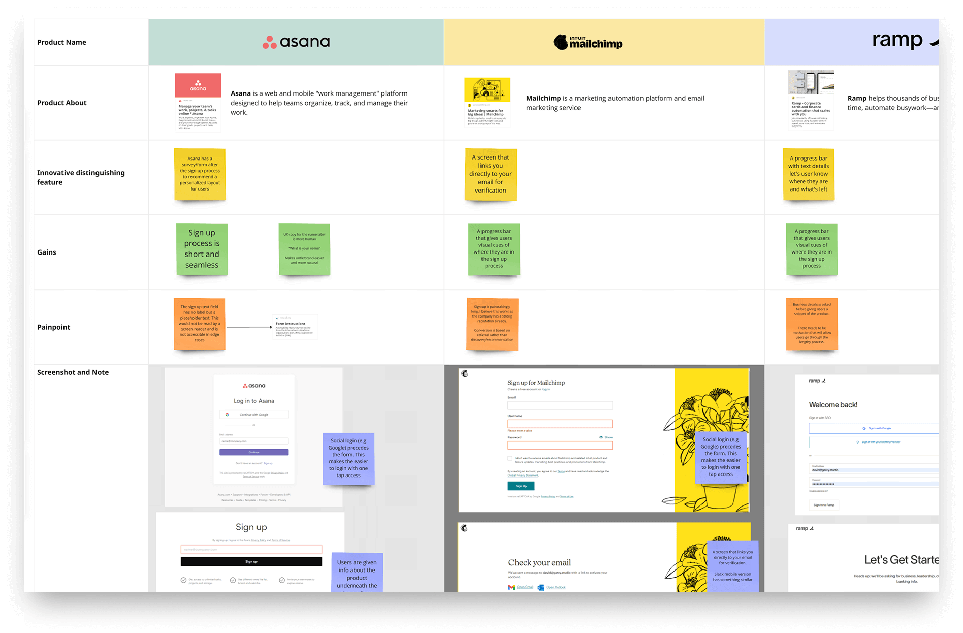
As a fast paced startup with limited time and budget, we couldn’t conduct one-on-one interviews with users. However, I relied on:
As a fast paced startup with limited time and budget, we couldn’t conduct one-on-one interviews with users. However, I relied on:
- A secondary report based on user feedback collected by the Customer Success team.
- A UX audit analyzing user experience, user flows, and journeys, along with behavioral insights from Hotjar.
- Stakeholder feedback to ensure our alignment with business strategies.
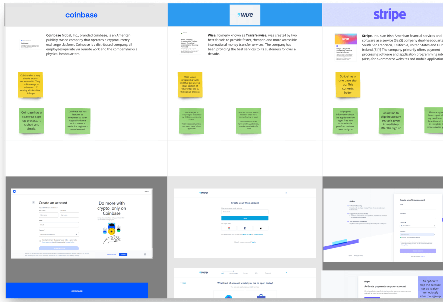
- Additional secondary research on competitors to gather further context and insights.
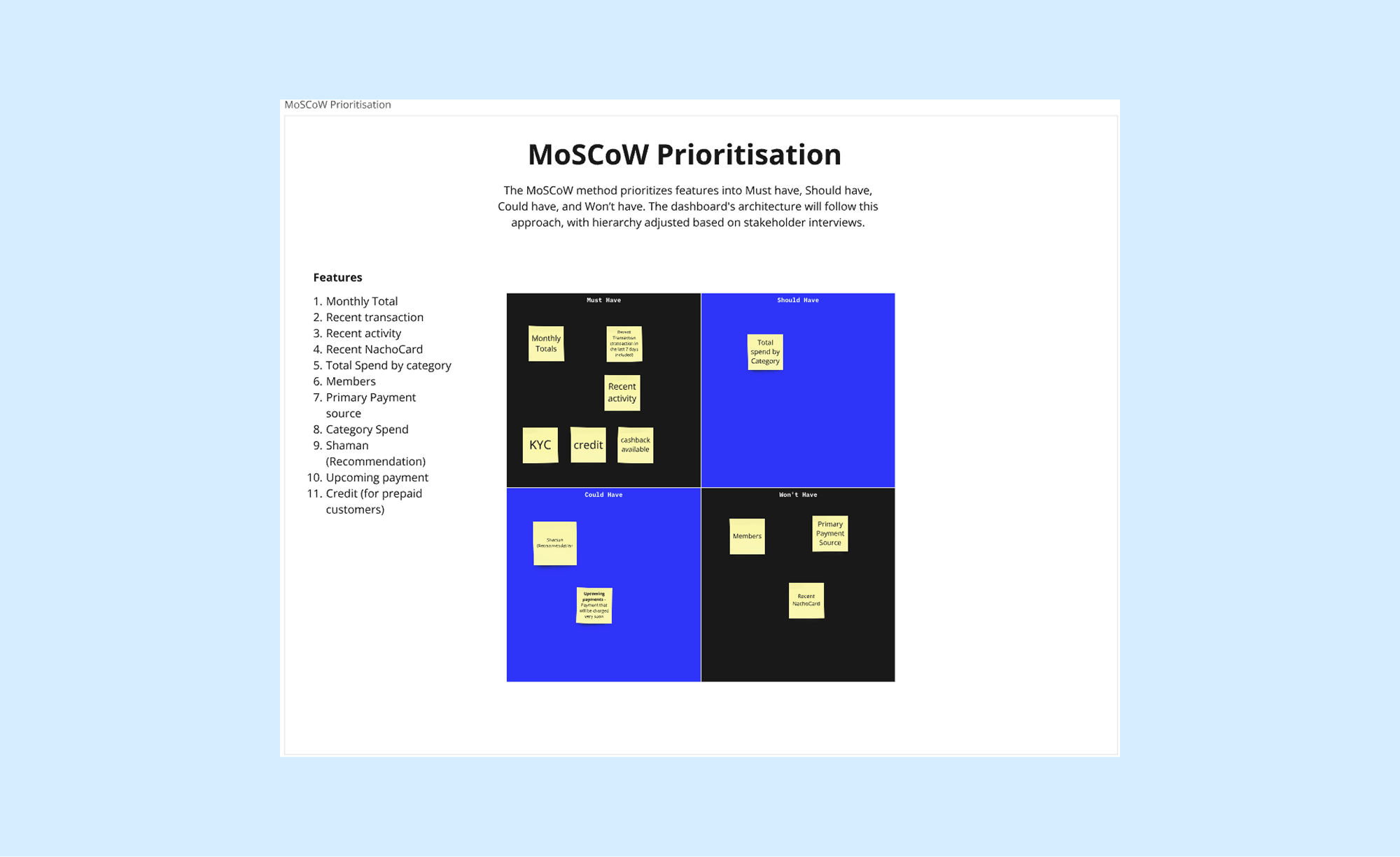
Problem Statement: So, what exactly wasn’t working?
Insight from research
A deep dive into NachoNacho’s experience revealed
several problems.
- The onboarding process was too long: A long KYC form was required before gaining access to the product. Users had to complete KYC for both personal and business accounts before accessing the platform. Many screens contained only a single question, making the process feel unnecessarily tedious and frustrating.
- NachoCard creation was complicated – The standout feature of the product was the creation of NachoCards, a virtual credit card designed to help you manage all your subscriptions. The process spanned multiple pages, involving 10 to 12 steps depending on who the card was assigned to.
- Component inconsistencies – Many components were not scalable, often designed for one-time use without reusability in mind. There was no unified component library to serve as a single source of truth for design and development.
- Poor Accessibility (A11Y): Color contrast and text sizes did not follow accessibility best practices, making the product less inclusive.
- Outdated User Interface – The UI was outdated and needed a modern, more refined look and feel.
Design Strategy: Our Guiding Principles
Growth
Simplicity
Scalability
Our main focus for the product was reducing friction
in the user journeys. How do we maximize for growth
while ensuring the design remains simple and
scalable?
Who are we designing for?

A typical user of NachoNacho (User Persona)
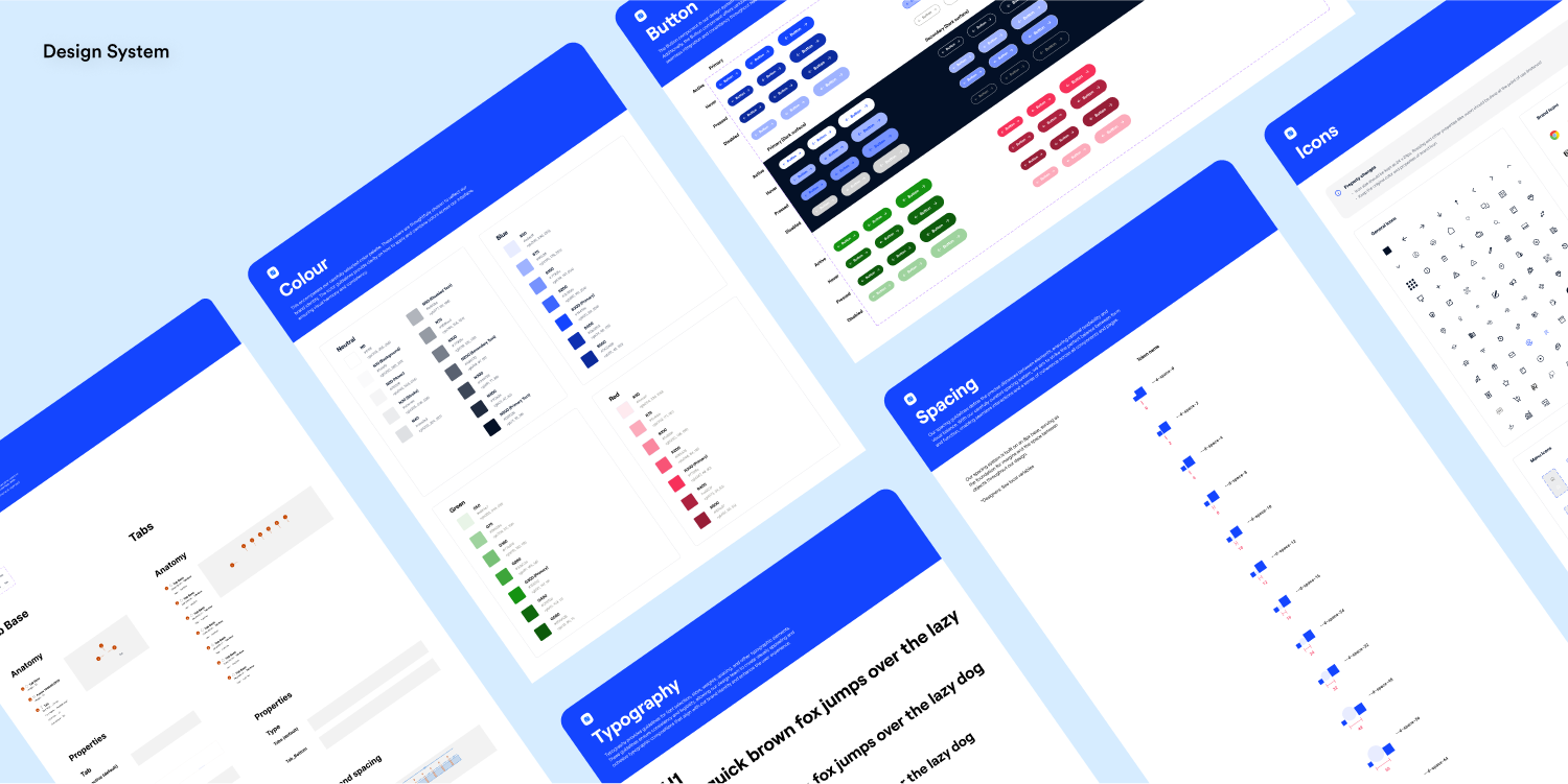
Design System
In our effort to prioritize simplicity and
scalability, I led the development of our first
design system to ensure consistency across all
products. This enabled us to ship redesigns
faster while maintaining a unified UI, which was
especially valuable for new offerings like
Service Marketplace and the SaaS & AI
Marketplace.
Ultimately, it reduced design and development time by at least 50%.
Ultimately, it reduced design and development time by at least 50%.
Design System
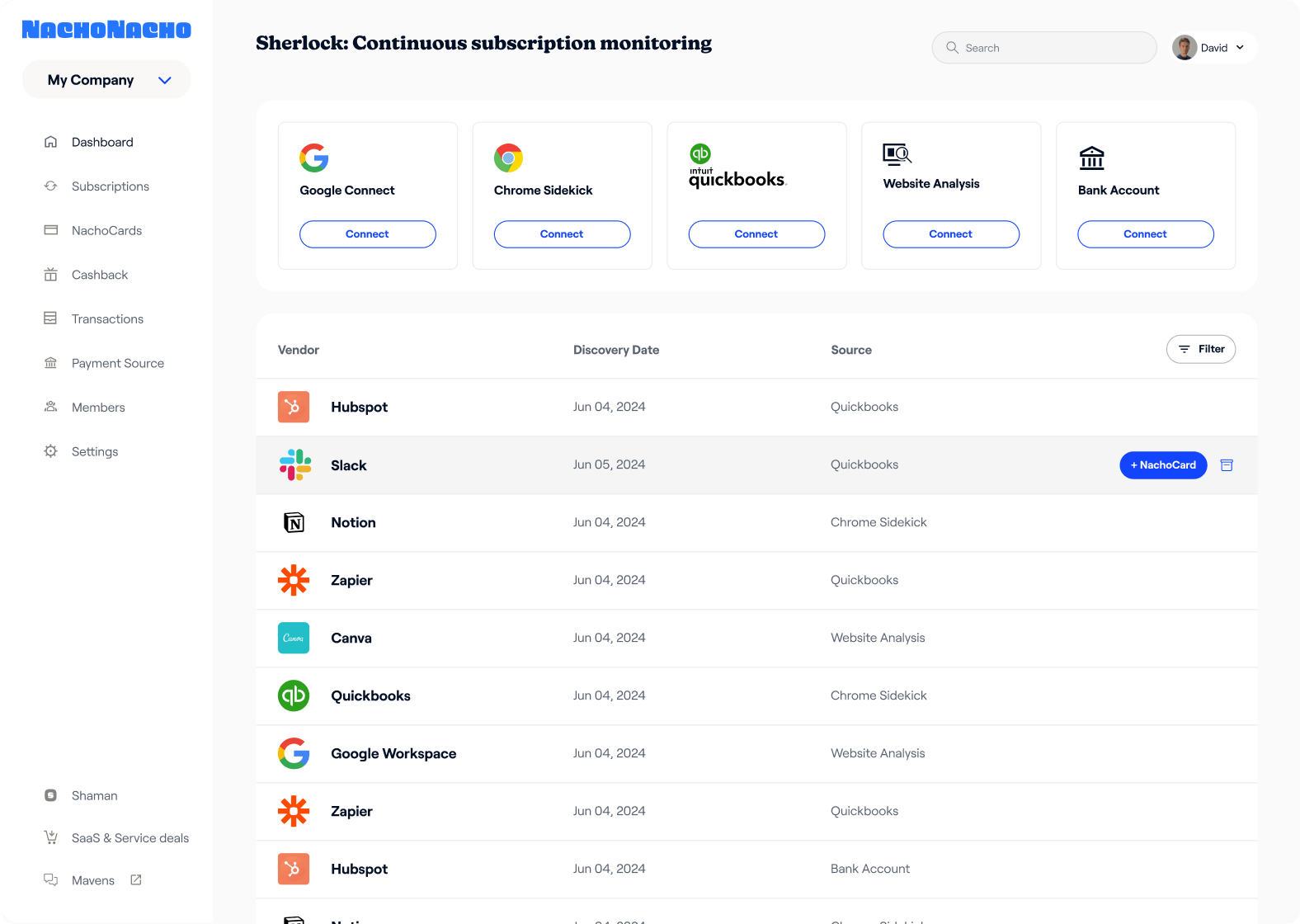
How did we solve the problems?
Onboarding Flow Redesign
The onboarding process was long and repetitive,
requiring extensive personal and business KYC forms
upfront.
We brought the KYC into the app, allowing users
to explore first through a guided
walkthrough.
This way, they would see what we can offer them.
They also get opportunities to create mock
NachoCards. This reduced our drop off rate and
boosted engagement.

Onboarding Journey
Account Verification (KYC)
We focused on reducing cognitive load of the KYC by
breaking the process into simple steps and
incorporating progress indicators for better user
guidance.
We initially designed the KYC process as a full-screen experience but ultimately opted for a side sheet layout for better accessibility. This allows users to bring back the KYC page with a single click, keeping the experience seamless.
We also introduced a “Continue Later” button, giving users the flexibility to complete verification at their own pace, making the process feel like a choice rather than an obligation.

Old KYC screens

Old KYC screens
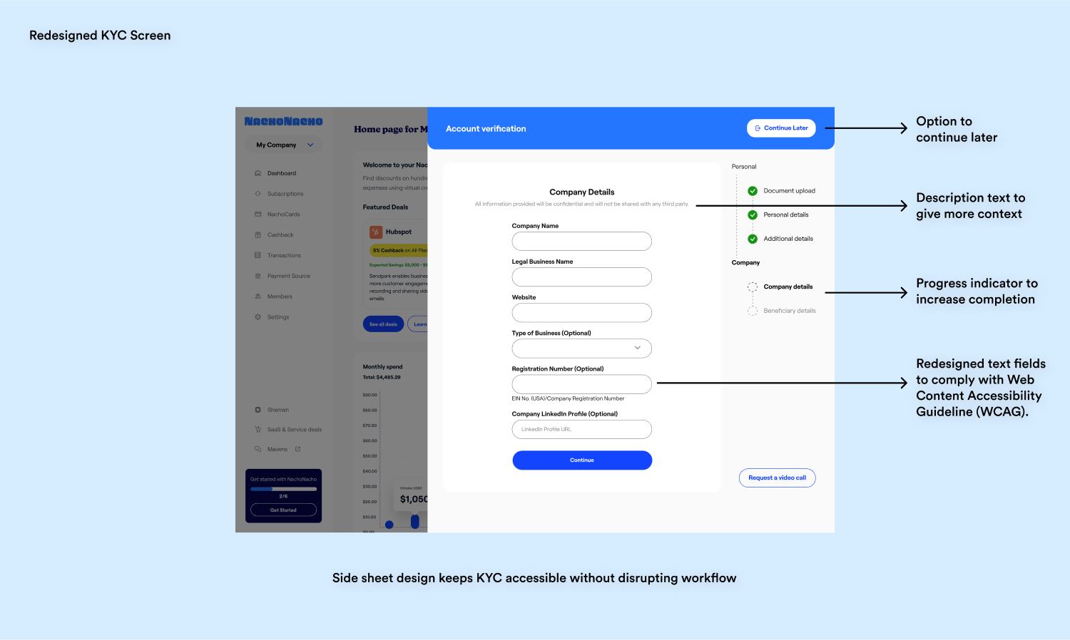
Redesigned KYC screen
NachoCard Flow Redesign
The process of creating a NachoCard, a virtual
credit card for managing subscriptions, was was very
ong, requiring around 10 separate screens. To make
it faster and easier, we applied the same side sheet
approach used in KYC, reducing it to a single page
making it faster and easier for users.
We ensured that the entire journey of creating a NachoCard remained within the side sheet for consistency and ease of use.
We ensured that the entire journey of creating a NachoCard remained within the side sheet for consistency and ease of use.
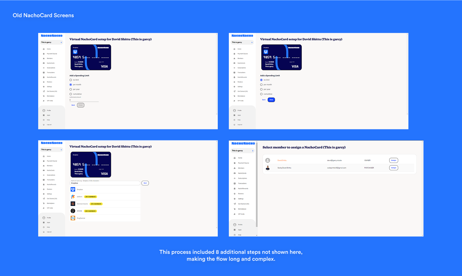
Old NachoCard Screens

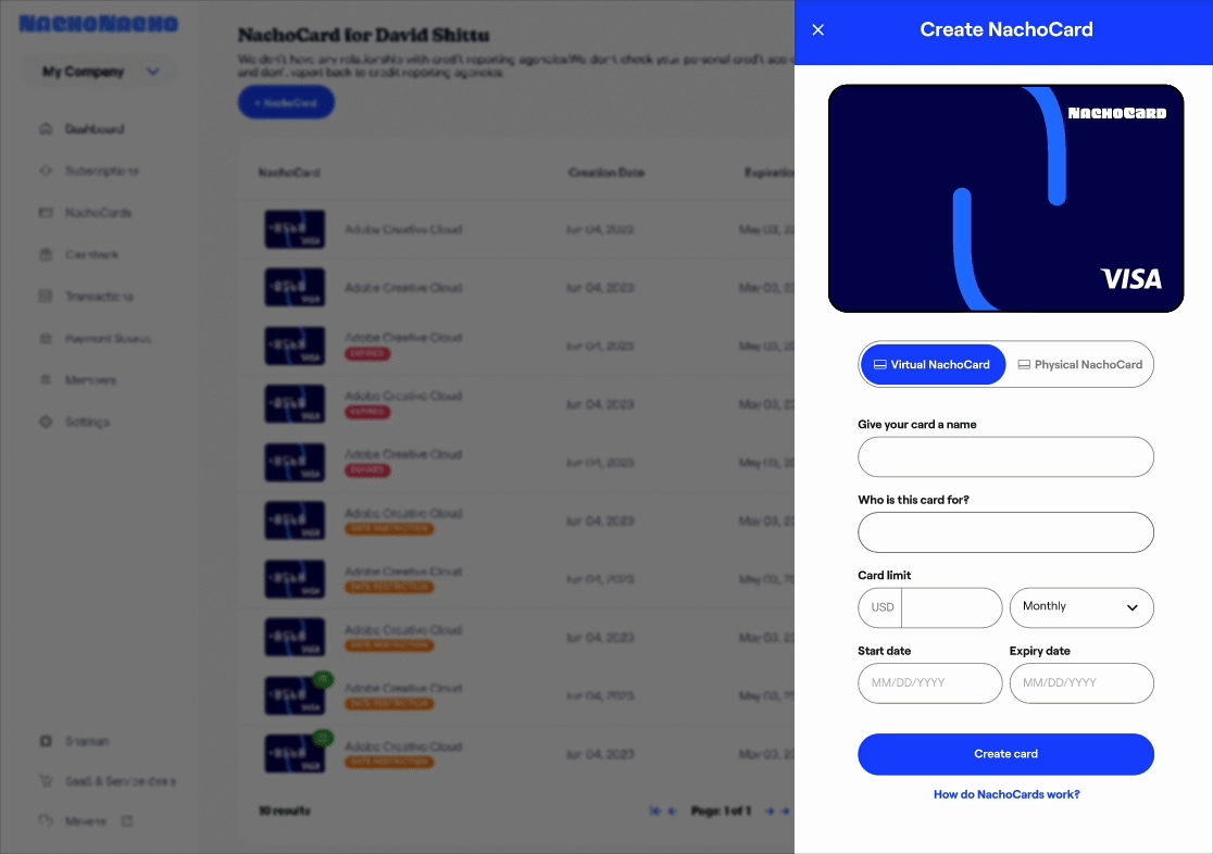
Redesigned NachoCard Screen
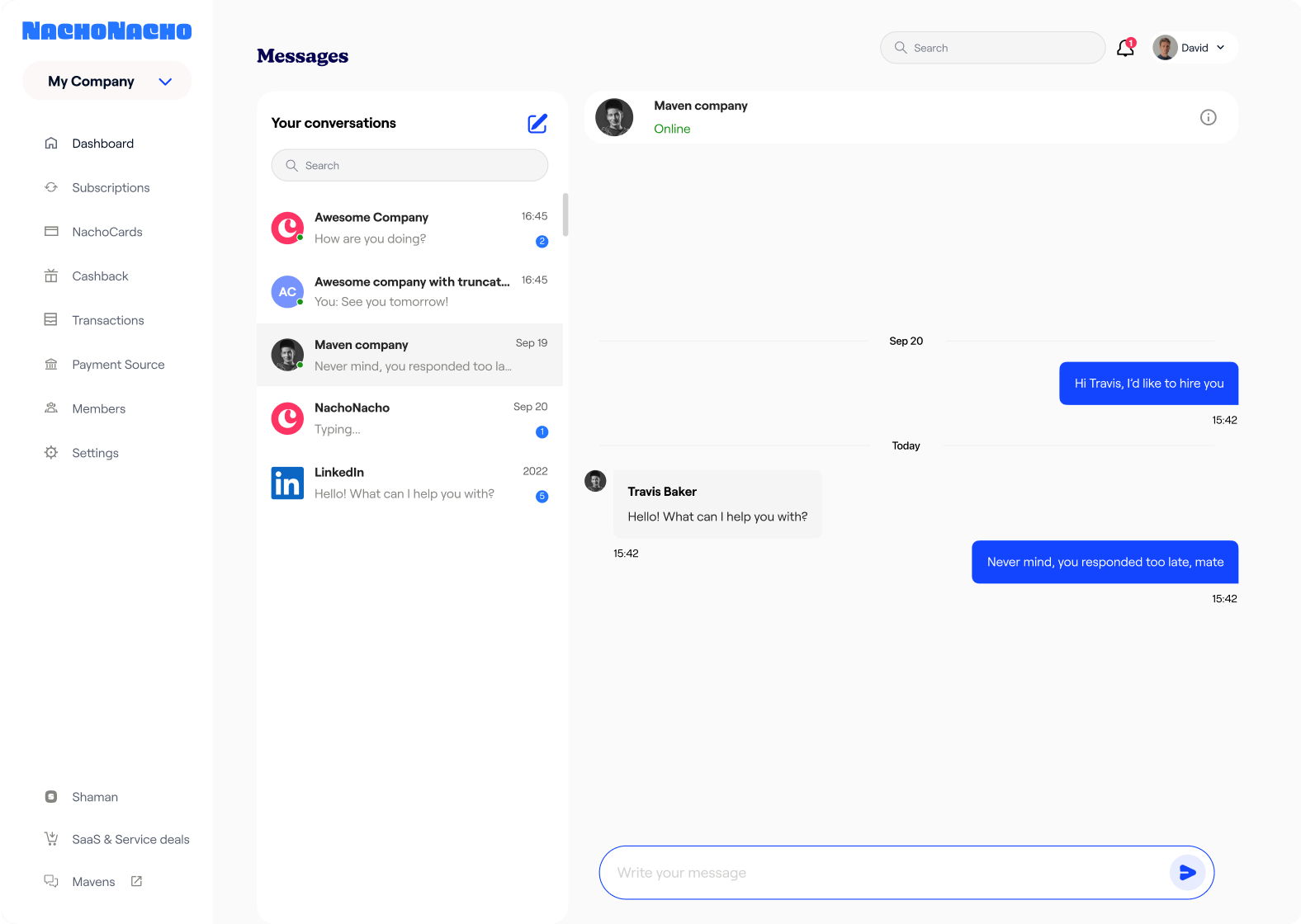
Sidebar Navigation Redesign
Over the years, we've continuously refined our
sidebar design to make navigation simpler and more
intuitive for our users.
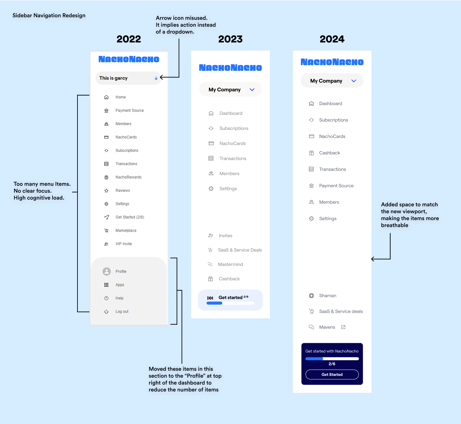
Sidebar Navigation Redesign
Onboarding
We implemented a clean, minimalistic design for the
login screen to reduce cognitive load and ensure a
seamless user experience.
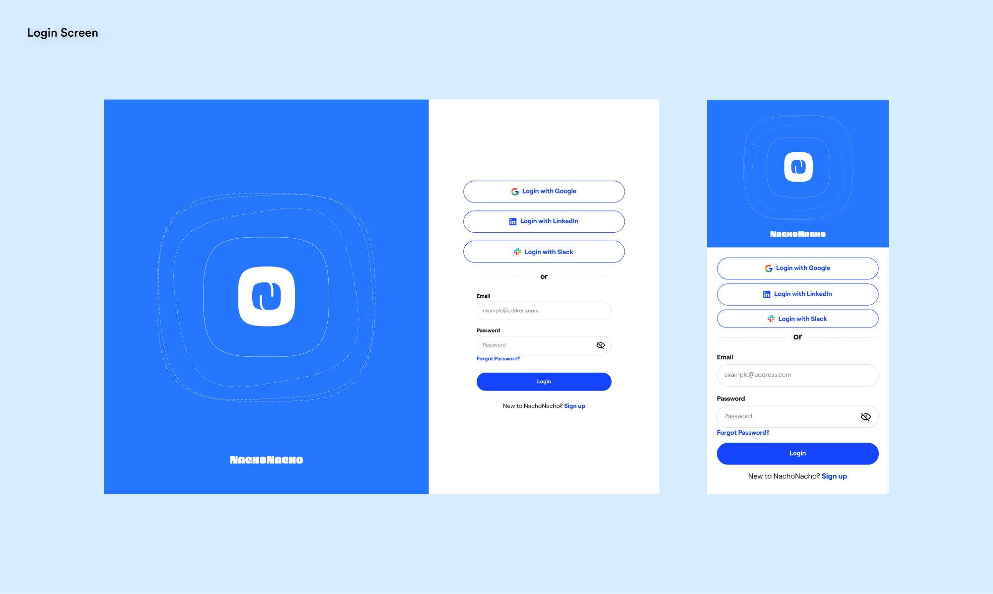
Login Screen
We have since the added a host of other features to
improve our UX and business offerings. We launched
the AI & SaaS Marketplace and the Service
Marketplace, along with Shaman, our AI-powered
product recommendation system. Currently, we are
scaling up and experiencing significant growth as we
prepare for our next phase.
Success Metrics
35%
Increase in Customer Acquisition
32,000+
Active Businesses
900+
SaaS Vendors
With combined efforts from the design team and other
departments, we successfully increased product
adoption. By integrating our various offerings, we
facilitated a smooth transition from a freemium
model to a paid subscription.
This is not the end. We keep working on several iterations as we get feedback from our users.
What’s Next
We have since the added a host of other features to
improve our UX and business offerings. We launched
the AI & SaaS Marketplace and the Service
Marketplace, along with Shaman, our AI-powered
product recommendation system. Currently, we are
scaling up and experiencing significant growth as we
prepare for our next phase.
What did I learn?
Effective Communication: One thing
that stood out to me was communication. Like in any
organization, we had many ideas that sometimes
conflicted. However, through
active listening and patience, we
ensured that everyone’s ideas were heard, making our
process more seamless and efficient.
I particularly learned the value of framing my suggestions in an open-ended way, allowing them to evolve from the idea itself rather than being tied to the speaker. This approach encouraged a more collaborative and fluid exchange of thoughts.
I particularly learned the value of framing my suggestions in an open-ended way, allowing them to evolve from the idea itself rather than being tied to the speaker. This approach encouraged a more collaborative and fluid exchange of thoughts.
What would I do different?
Balancing Speed with Efficiency: It
is understandable that the startup ecosystem
requires a fast-paced approach. Move fast and break
things, as they say. However, if I were to do this
again, I would push for more time to better
understand our users.
Launching features just for the sake of testing was not the best approach. There should be a balance between moving quickly and taking the time to build things well. No matter how fast you launch, if a feature is poorly designed, it will always fail. It’s a test that is doomed to fail.
Launching features just for the sake of testing was not the best approach. There should be a balance between moving quickly and taking the time to build things well. No matter how fast you launch, if a feature is poorly designed, it will always fail. It’s a test that is doomed to fail.
Key Collaborators
Tom Garcy (Design), Andy Karuza (Product), Moché
Matagrin (Engineering), Alan Szternberg
(Engineering), Igor Schechtel (Engineering) and more
Next Project