UX Research,
Product Design (UX/UI),
Design System.
Bohemian Research helps businesses gain insights through
market research.
Their Multipolls app solves this, but they need a
rebranded app for a different market.

My Role
Platforms
Mobile App
(Android & iOS)
(Android & iOS)
Tool
Figma,
Notion, Asana.
Notion, Asana.
Time
2024
Overview
Maintaining two products with the same functionality
but different branding means ensuring both stay
updated simultaneously. While manual updates are an
option,
a system that automates updates across both
products makes the process more efficient and
scalable.
Bohemian Research helps businesses and organizations uncover actionable insights through global market research. With 5 million users across 50+ countries, they offer surveys, interviews, and flexible research methods to deliver meaningful results quickly and cost-effectively through their app, Multipolls.
Now, they need a new app, Golden Survey, to do the same thing but with a new brand and color scheme tailored for a new market.
50%
Increase in revenue each quarter
4.3

Based on 1.04M reviews
5M+
Downloads on Google Play Store
Context
We started with a redesign of their existing app. We
already had a functional product with poor UX but wanted
a more modern, user-friendly experience to reduce
friction and grow our user base. We began the redesign
process by refining both the UI and UX.
It was only after completing the MultiPolls
redesign that we realized we needed to create a new
app with a distinct brand: Golden Survey.
In this case study, I’ll briefly walk you through the redesign process but will focus primarily on how we built scalable colour tokens to transition from Multipolls to Golden Survey seamlessly.
In this case study, I’ll briefly walk you through the redesign process but will focus primarily on how we built scalable colour tokens to transition from Multipolls to Golden Survey seamlessly.
Making a UI refresh: How did we do it?
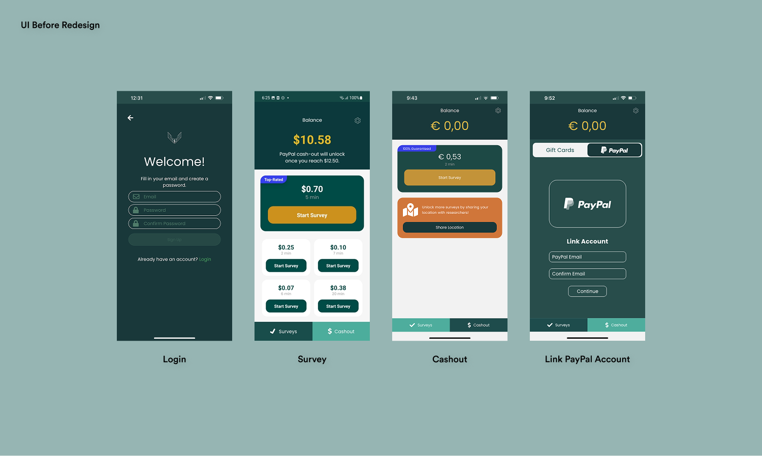
UI Before Redesign
My Approach
Our primary goal in the Multipolls redesign was a UI
refresh. The product had good traction, but the team
wanted a more polished interface and smoother flow
to enhance user engagement and minimize friction.
While UX was important, the main focus was on
improving the UI.
What We Did:
What We Did:
- Conducted a UI audit: Reviewed the entire app to identify strengths and areas for improvement.
- Analyzed competitors: Studied what they were doing better and how their UI stood out.
- Explored opportunities for improvement: Identified ways to elevate Multipolls' UI to the next level.
- Collected stakeholder insights: Ensured alignment with the broader business strategy.

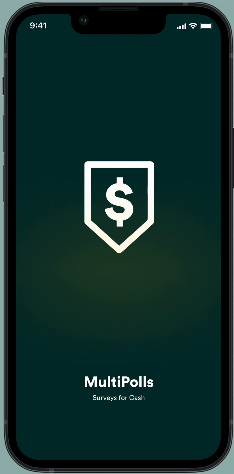
Redesigned Splash Screen
What did we solve in the redesign?
Redesigns
- Redesigned UI Flows for a seamless user experience
- Refreshed user interface with a clean and intuitive design
- Improved Color Contrast to improved accessibility and compliance
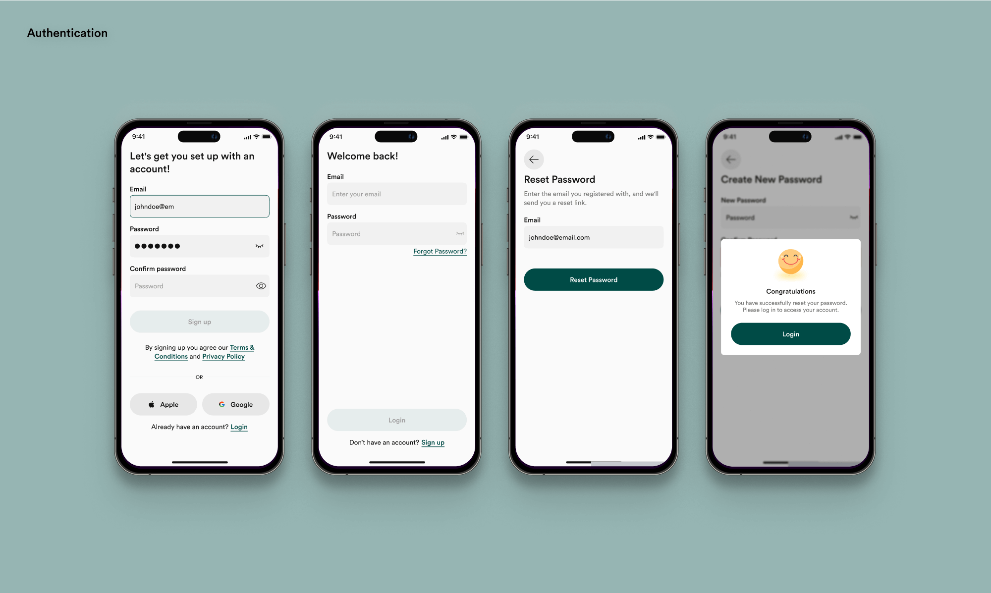
Authentication
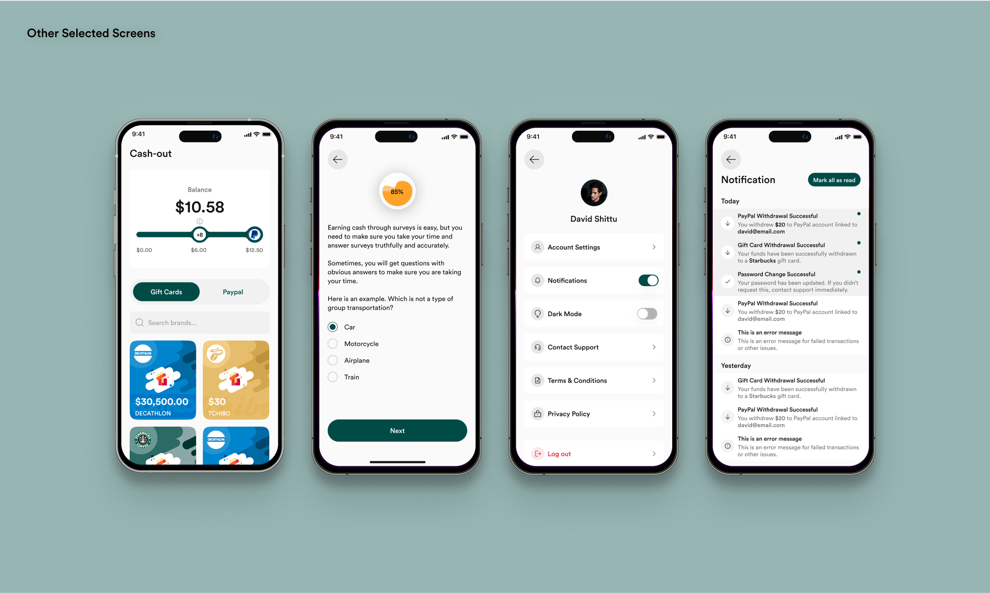
Other Selected Screens
How did we create our token structure?

Token Structure Plan
Semantic Token Structure Ideation
Creating the right semantic token structure proved
to be a big task.
The major challenge was finding a structure
that would be scalable without requiring
unnecessary naming conventions.
I wanted something simple and easy to understand as
you follow the token hierarchy. I didn’t want a
token structure with too many levels, as that would
make it overly complex. At the same time, we didn’t
want a structure that lacked clarity in its naming.
Eventually, I ended up with a four-level semantic token structure.
Eventually, I ended up with a four-level semantic token structure.
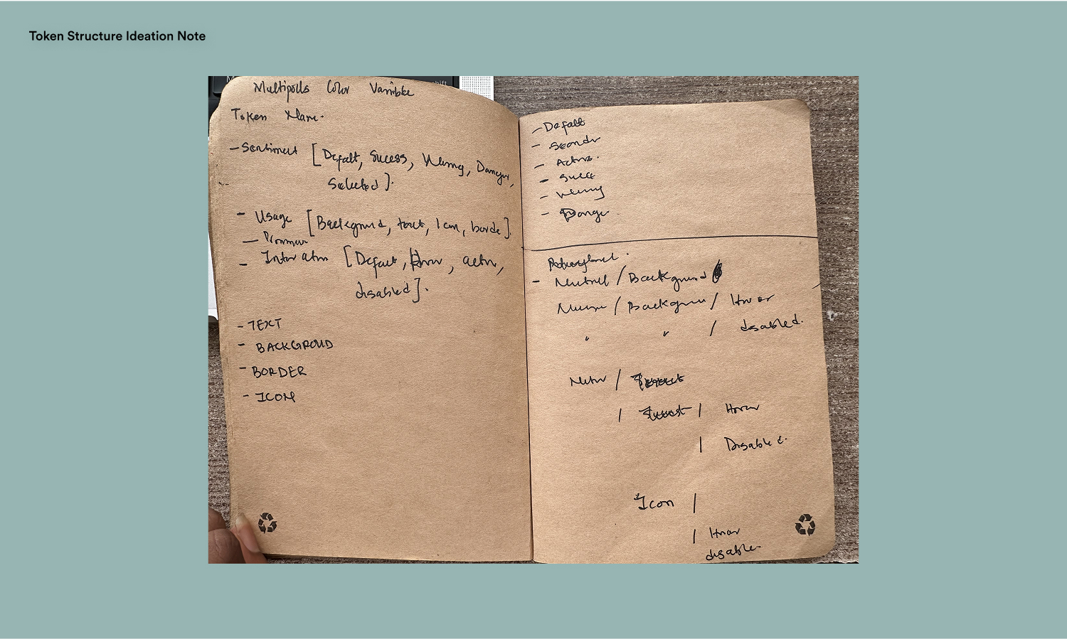
Token Structure Ideation Note
Semantic Token Structure
- Usage (Surface, Text, Icon, Border, etc.): This defines how colors are applied within the UI, such as for backgrounds, text, icons, or borders. Yes, I used Surface instead of Background. Material designed influence me :)
- Sentiment (Default, Success, Warning, Danger): This represents the emotional or functional meaning of a color, such as green for success, yellow for warnings, and red for errors.
- Prominence (Default, Weak, Medium, Strong): This controls the visual hierarchy by defining how bold or subtle a color appears. For example, stronger prominence may be used for primary buttons, while weaker prominence is used for secondary actions.
- Interaction (Default, Hover, Active, Disabled): This defines how colors change based on user interactions, such as hover states, active clicks, or disabled elements. This ensures clear affordances and feedback in the UI.

Four Level Token Structure

Typical Colour Token

Token Usage Examples
Finding the Right Brand Colours
We knew we wanted purple and yellow to be part of
the new brand identity, but we were not sure of the
ideal combination. To explore our options, we tested
various color variations using our variables panel
to seamlessly switch between them.
I prioritized accessibility by testing various color combinations to ensure they met the Web Content Accessibility Guidelines (WCAG) for contrast.
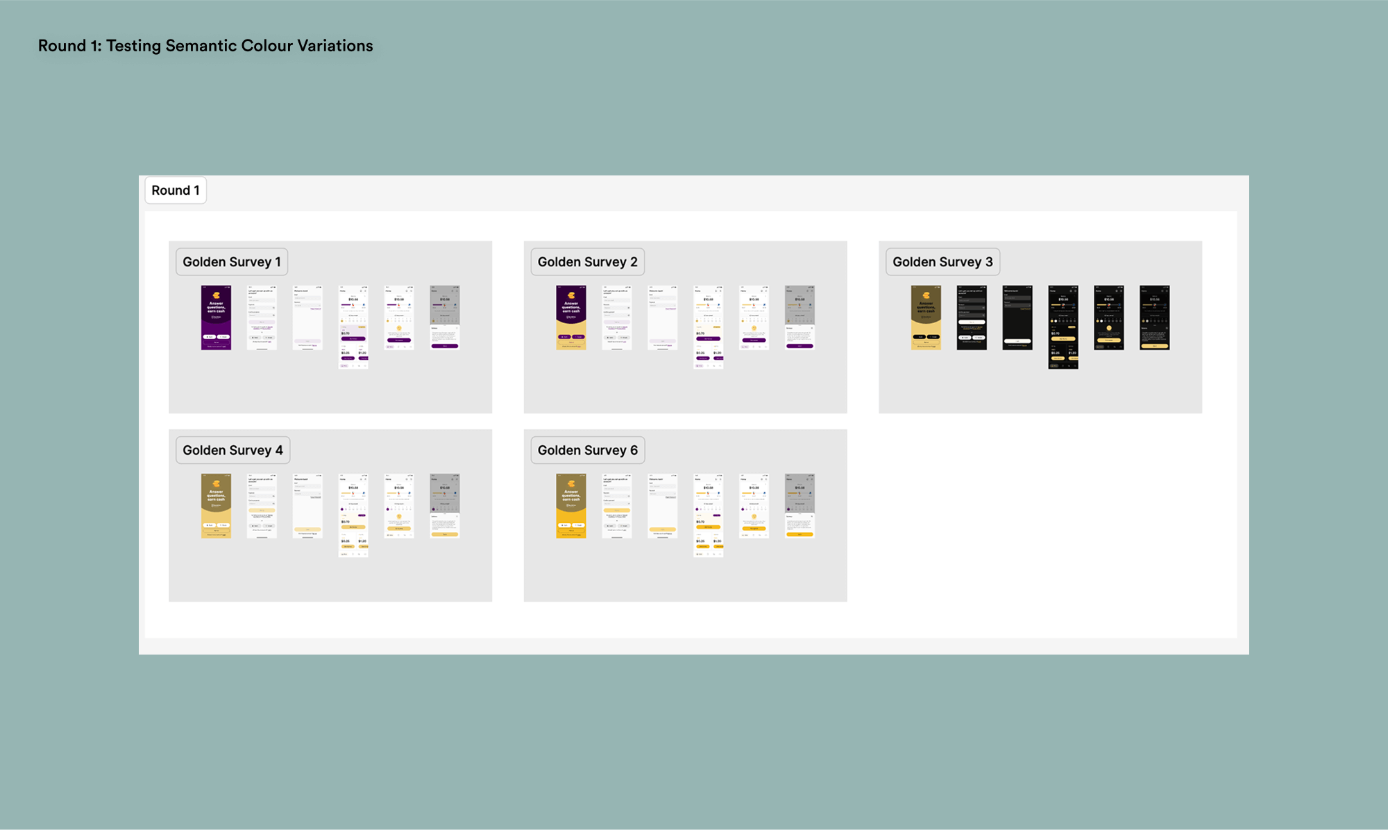
Round 1: Testing Semantic Colour Variations
In the second round, we narrowed it down to three
options and decided to stay with the design in light
mode. I ran several tests to ensure the color
combinations were accessible.
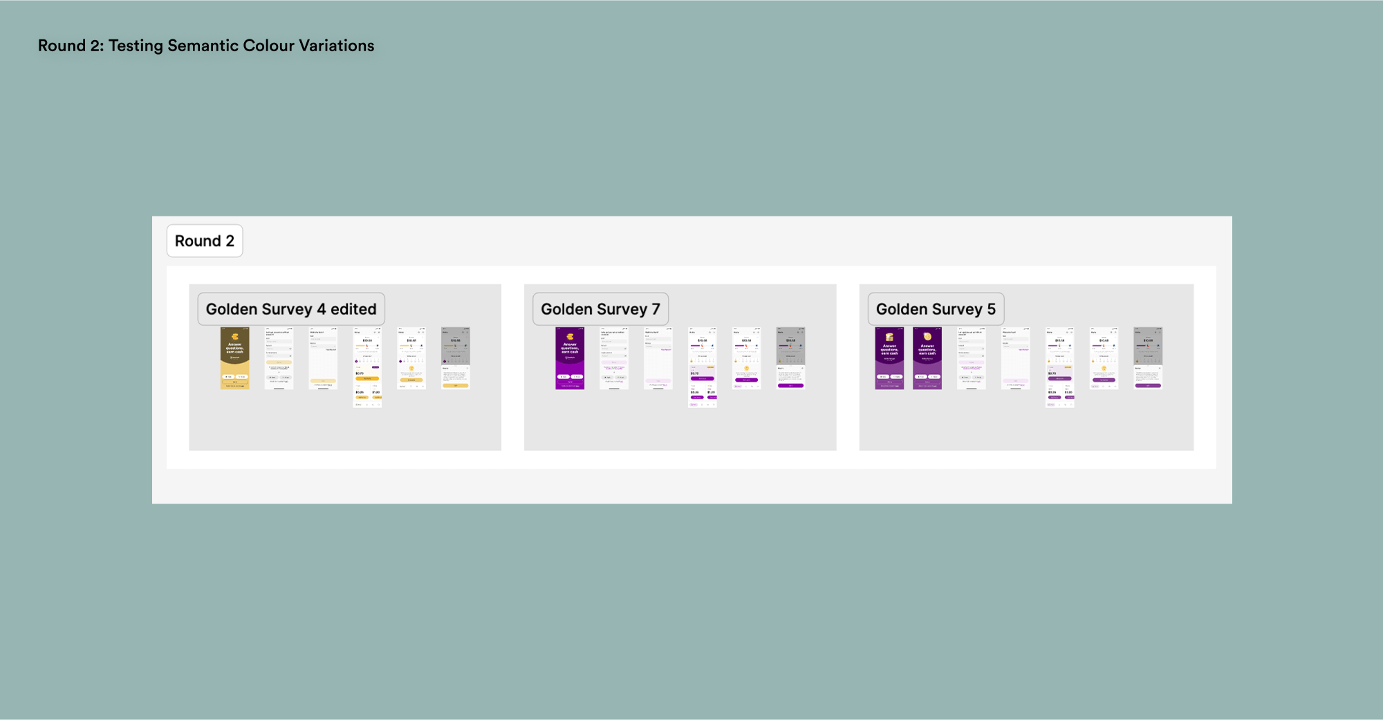
Round 2: Testing Semantic Colour Variations
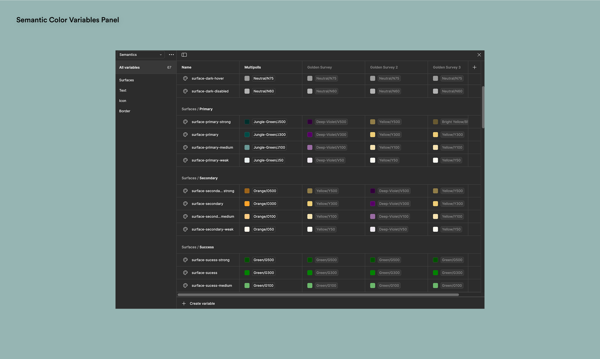
Semantic Color Variables Panel
Final Colour Design
We ultimately went with a yellow primary colour with
purple as the accent. Our sentiment and background
colours remain unchanged. We ensured that all color
combinations met the Web Content Accessibility
Guidelines (WCAG) to ensure the design is inclusive
and accessible to all users, including those with
visual impairments.

Final Design Variant
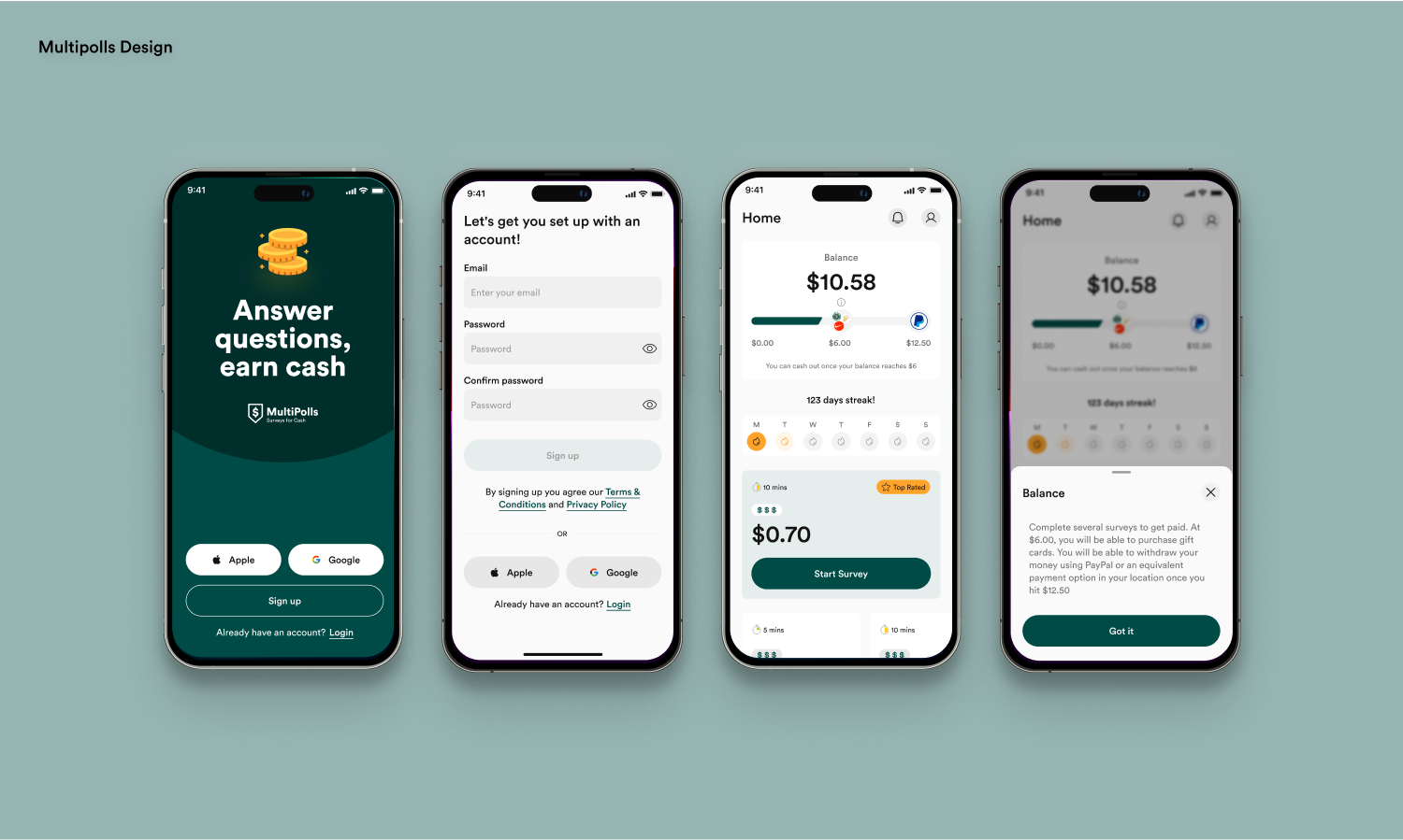
Multipolls Design
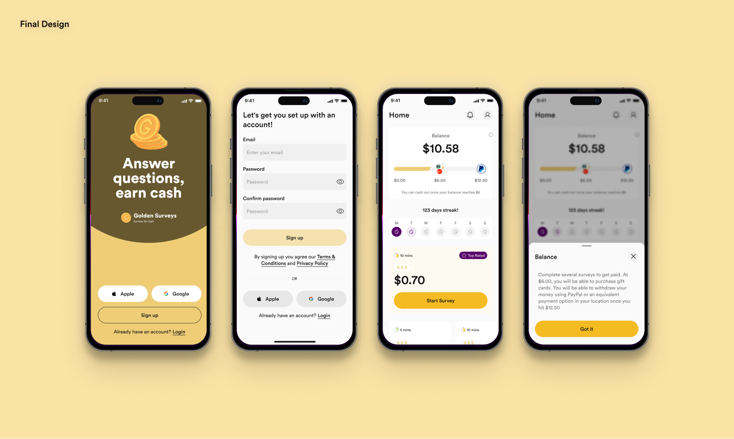
Final Design
Success Metrics
50%
Increase in revenue each quarter
4.3
Based on 1.04M reviews
5M+
Downloads on Google Play Store
Our redesign of Multipolls contributed to 5 million
downloads across 50+ countries, supporting 23
languages, all efficiently managed by just one
customer support representative. This success was
driven by a combination of robust technology and an
intuitive user experience.
We also achieved 100K+ downloads for Golden Survey on the Google Play Store, earning a 4.3-star rating from 24.9K reviews.
We also achieved 100K+ downloads for Golden Survey on the Google Play Store, earning a 4.3-star rating from 24.9K reviews.
What did I learn?
Contrast & Legibility: When working
on semantic color tokens, I discovered that ensuring
accessibility was more challenging than expected.
Simply swapping colors for their opposites on the
color scale didn’t meet WCAG standards for dark
backgrounds. Contrast had to be adjusted, as
mathematically opposite colors didn’t always provide
enough readability. I tested colors in context, used
contrast checkers, and refined them to balance
accessibility and design consistency.
The neon sign effect and logarithmic brightness were
crucial considerations for dark mode colors. Although we
ultimately didn't use a dark mode color, the experience
was valuable.
What would I do different?
- Prioritizing Acronyms in Token Names: While my token names have been clear, using a consistent set of acronyms would improve efficiency and clarity. Standardizing acronyms ensures easier reference, scalability, and consistency across the design system.
- Creating Color Semantic Tokens Early: Creating color semantic tokens earlier would have saved time during the redesign. However, not every project needs them from the start, especially in smaller companies. The key is balancing scalability with efficiency.
Key Collaborators
Tom Garcy (Design), Vineeta Sagar (Design), Petr Horáček
(Engineering).
Next Project